Contemporary Masterpieces at the Leipziger Messe

You can discover high-calibre contemporary artworks throughout the outdoor areas and buildings of the Leipziger Messe. We are home to works by renowned artists such as Isa Genzken, Martin Kippenberger and Sol LeWitt, to name but a few.
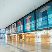
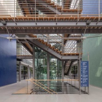
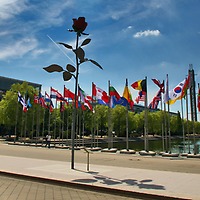
As soon as they enter the Glass Hall, visitors are greeted by Genzken's monumental "Rose". When walking around the grounds of the Leipziger Messe, you will come across a variety of other fascinating works and experience the trade fair as an atmospheric place for business encounters, combining everyday trade fair life with trade fair experience. You will also repeatedly come across installations, subtle text works and murals in the entrance area of the Glass Hall, in the connecting tubes between the exhibition halls as well as in the halls themselves.
"Art at the Leipziger Messe" Project
Artists from all over the world have helped to shape the Leipziger Messe. They developed concepts for murals, installations and the design of functional areas especially for the new Exhibition Centre, inaugurated in 1996. They were invited to choose suitable places for their work on the site as early as the construction phase. The project "Art at the Leipziger Messe" was curated by Brigitte Oetker, Christiane Schneider and Mechthild von Dannenberg.
Angela Bulloch (1966): Belisha Beacon Indicator System
Lamp installation, connecting tubes between Glass Hall and East Entrance Hall and to Halls 4 and 5
Angela Bulloch's work deals with the organisation and rules governing human coexistence. For her light installations, she uses "Belisha beacons" – light signals used to mark pedestrian crossings in England. In so doing, she incorporates a motif from road traffic, an omnipresent system of order and regulation. For her Leipzig work, these light signals are fitted with motion detectors. The flow of visitors becomes an integral part of the installation: Each individual actively shapes the work by triggering a light reaction – passers-by thus become part of an order that they themselves can influence.
Daniel Buren (1938): Das Auf und Ab der Farbe (Ebb and Flow of Colour)
Escalators, Glass Hall and Congress Center Leipzig
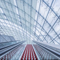
Daniel Buren uses 8.7 cm wide vertical stripes to "draw" a space. He does not distinguish between space and work, since work can only be realised in and through reference to space. He refers to this interaction of stripes and place as work "in situ". He came to his decision to use stripes in 1968 as a radical rejection of traditional painting and the notion of the autonomy of the work of art. As is the case in Leipzig, his markings often constitute small interventions in the surrounding space. In Leipzig, Buren added red and white stripes to 31 of the 70 or so steps of each escalator. In relation to the dimensions of the large Glass Hall, the Congress Center Leipzig and the East Entrance Hall, the markings are minuscule. Yet through movement – the appearance and disappearance of colours – the work nevertheless attracts the eye. The escalators designed by Buren thus establish a connection between the individual locations.
Stanislaw Drózdz (1939–2009): odtad – dotad (Where to – Where from)
Text work, Foyer Hall 1
Stanislaw Drózdz's works take short texts or words as a starting point. They then become images as their semantic meaning is first destroyed, for example by arrangement in space, in order to emerge anew. Drózdz's text work for the Leipziger Messe stretches over a length of 80 metres. The Polish words "odtat" and "dotad" are painted in black on the white wall. The arrangement has no strict rhythm and creates a loose sequence on the foyer wall.
Peter Fischli (1952) and David Weiss (1946–2012): Landschaft (Landscape)
Work on concrete, final stop of line 16
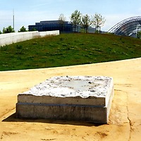
Since their first joint works in 1979, Peter Fischli and David Weiss have been concerned with scale and perception, orders, norms and hierarchies. The 210 x 320 cm concrete landscape that they created for the Leipziger Messe appears to be a product of chance, like building rubble eaten away by erosion or – as Peter Fischli describes it – the site for a "puddle". However, if the viewer changes his perspective, adjusts his gaze to "fine-tune" and lets his imagination run wild, the image might change: Furrows become valleys, erosion creates ridges and the puddle appears as a lake. Moss grows, small creatures colonise the new habitat and the elements create their own microcosm.
Günther Förg (1952 - 2023): Wandmalerei (Wall Painting)
Messehaus Atrium
Günther Förg works with various media: Photography, painting, sculptures, drawings, murals, often combined into complex spatial installations. He is interested in architecture and its structures. This exploration usually manifests itself in a series, where he skirts around a theme rather than concluding it definitively. His site-specific murals consist of monochrome patches of colour that refer to the dimensions of the particular space and are intended to create a dialogue with the surroundings. In his Leipzig work, the wall is divided into two halves. Four colours are applied to eight fields. The unique brushwork creates a painterly quality that creates orientation points within the architecture and renders it an unmistakable place.
Isa Genzken (1948): Rose
Glass Hall, West Entrance
"A rose is a rose is a rose" The oft-quoted saying by American writer Gertrude Stein refers to the variety of meanings the rose has as a symbol of love, pain and transience. When viewed up close, Isa Genzken's oversized metal rose develops a naturalistic, sculptural character and appears huge, almost threatening. With a metallic stem visible beneath the blood-red flower, it is irritating in its artificiality. Its positioning in the centre of the symmetrically staged perspective created by the glass and steel architecture sets a counterpoint as a luminous splash of colour and, in its exaggerated size, at the same time caricatures the monumentality of the Glass Hall.
Dan Graham (1942 - 2022): Messe Leipzig Structure
Transparent Pavillion, Pocket Park
A defining theme in Dan Graham's work is the interaction of the influences of society and architecture. He has been constructing pavilions made of one-way mirror glass for special locations since the 1970s, incorporating and reflecting the formal repertoire of urban architecture and drawing on simple geometric forms such as the circle, oval, rectangle and triangle. Since the one-way mirror glass is both reflective and transparent on the inside and outside respectively, the viewer sees himself and at the same time others, who in turn perceive him and themselves. Added to this is the changing perception of the work due to changing weather conditions, different incidence of light and altered viewing angles. The one-way mirror pavilion occupies the open space between the West and East Halls, allowing a view of its interior or blocking views from the outside, depending on the light conditions. Graham sees his pavilions as aesthetic objects as well as places for social contact, which can only fulfil their meaning through the use and experience of the viewer.
Martin Kippenberger (1953–1997): Metro Net
Underground station for an imaginary global underground network, Messepark
The work of Martin Kippenberger is characterised by the interplay between fiction and reality – the realisation of absurdities and the enigmatic questioning of the real. The underground station on the grounds of the Leipziger Messe is neither closed nor really in operation. It is part of an imaginary global underground system created by the artist through his "Metro Net" project. Other such entrances terminating underground and leading nowhere exist in Dawson City (Canada) and on the island of Syros (Greece). Further entrances in air shafts in Tokyo and in Sankt Georgen in the Black Forest also belong to this underground system. "Metro Net" is aimed at thought travellers – to imagine is to already be on the road.
Sol LeWitt (1928–2007): Wall drawing # 516
Mural, Congress Center Leipzig
Since the 1960s, Sol LeWitt has reduced his creative language to stereometric basic forms, using the primary colours red, yellow, blue and black. Using these simple means, he designs serial systems of rules with calculated variations – whereby the differences between the individual parts form the theme of his composition. The work created for the exterior walls of the halls in the Congress Center Leipzig is considered to be one of his drawings that, along with his sculptures, occupies an important position in the artist's oeuvre. It shows a pyramidal shape (flat-top pyramid) in a row of square fields, to each of which three layers of primary colours are applied. The repetition of the same motif is accompanied by a wide variation of colours. Serial painting – an essential principle of Minimalist art, of which Sol LeWitt is the main representative – promotes the rejection of the unique artwork and abolishes hierarchies. The important thing is the mental process, rather than the execution, which he therefore leaves to others.
Thomas Locher (1956): Angebot und Nachfrage (Supply and Demand)
Text work, Messehaus Atrium
Thomas Locher examines language as a system of order imposed on interpersonal relationships. His texts made up of short sentences which follow grammatical rules to the letter are apparently not meant to mean anything beyond the statement – statements in themselves, highlighted and analysed by the installation. Locher's Leipzig work addresses the basic principles of trade and refers to the conception of the trade fair as a trans-shipment centre for goods and commodities. His text is divided into five blocks. Statements strung together in single lines, in black foil letters on glass, describe scenarios between giving and receiving, desire and rejection in different variations – at the same time serious and ironic, real and absurd. A dialogue takes place between an imaginary "I" and a counterpart.
Olaf Nicolai (1962): Pflanze / Konstrukt (Plant / Construct)
Terrazzo floor work, Glass Hall
Olaf Nicolai is concerned, among other things, with principles of order such as collecting as a form of preserving and handing down, or gardens (hortus) as places of knowledge and the cultivation of physis (plant) and meta-physis (order). He is referring to the 19th century, a time before the strict separation of the natural sciences and art. This is a way of thinking that is again gaining in relevance thanks to the interconnectedness of different areas and forms of knowledge. His work at the Leipzig Exhibition Centre thematises nature as a construct. The basis is the silhouette of a stylised vine. This is transformed into a surface ornament in the form of terrazzo work in the floor along the central axis of the Glass Hall. Nicolai thus refers to the surrounding architecture as well, picking up on its allusion to early glass palaces and greenhouses in England.
Hanno Otten (1954): Farbenlehre (Colour Theory)
Farbfeldarbeit (Colour Field Work), Congress Center Leipzig
Hanno Otten explores the phenomenon of colour in both the artistic and scientific dimensions. He is interested in models and theories that have classified colours according to different criteria since Newton and Goethe, as well as in the current meanings of and relationships between colours in scientific fields and in everyday life. The seven square panels arranged side by side in the Congress Center Leipzig present a contemporary inventory of colours. These have been filtered from light using a phototechnical process and visualised on light-sensitive Ilfochrome. This technique references the reproduction of colour in electronic media, increasingly dominant in the colours of our lived environments. The work also deals with the interplay between technical-objective and subjective colour perception. It illustrates the way in which colours in modern visual media, in all their dissonant combinations and glaring contrasts, have been taken up by fashion and transposed into everyday life. The awareness of colour and the associated understanding of harmony are shown to be temporal and fluid.
Jorge Pardo (1963): Design for the International Business Lounge
Glass Hall
Jorge Pardo broadens the definition of art by dissolving the boundary between applied and free art, incorporating elements of architecture and design into his work. When designing or modifying everyday objects he is concerned with function, form and colour as the creative foundations of our environment. He simultaneously engages critically with modernity through allusion and quotation. In his objects, the emphasis is primarily on their relationship to each other and the situations that they create for the viewer or user. Jorge Pardo had the furnishings of the International Business Lounge in the Glass Hall made according to his designs. The walls were painted to match.
Rirkrit Tiravanija, (1961): Flipper Wall for Palermo
Ensemble of 1.40 metre high walls painted oxblood red, Messepark
Rirkrit Tiravanija's "Flipper Wall for Palermo" commemorates his Leipzig-born fellow artist Blinky Palermo (1943 to 1977). He had one of Palermo's famous works reconstructed on a scale of 1:2: In 1973, Palermo had painted the partition walls at the Hamburg Kunstverein oxblood red and declared the site itself to be art. Tiravanija understands the art space as a social and cultural space. His contributions to exhibitions in galleries and museums often involve invitations to dine in the art space where he cooks for guests, or arrangements of furniture and utilitarian objects for visitors to use while engaging in conversation. In Leipzig, he has created a kind of monument to Blinky Palermo as well as a place of communication and experience. Tiravanija wants his work to be used – by children or school classes, for example, who should take ownership of his walls as play objects. True to the motto: "Something only comes alive when people touch and use it."
Niele Toroni (1937): Pinselabdrücke (Brush Prints) Nr. 50 at regular intervals of 30 cm
Wall painting, Messeclub Messehaus and Congress Center Leipzig
At the end of the 1960s, Niele Toroni, together with fellow artists – including Daniel Buren – revolted against "salon painting" and its claim to representation. He reduced his work to a painterly gesture which repeats itself – avoiding any content, any hierarchy. Each brushstroke represents itself and itself alone. An image is deliberately created from the sum of these uniform impressions. Toroni mostly employs primary colours, rarely mixtures such as orange or green. What is new in each work is the relationship between impression, background, architecture.
